

Glitter Girl inspiration: Layouts within Limitations
Hello everyone! I have a blog post here for you with three layouts that I made this weekend. I was watching old Glitter Girl videos, since they are my favourite scrapbooking videos to watch! I found this one and thought that I would take inspiration from it. All of the product used was from Hip Kit Clubs, mostly the December 2014 kit, some of the paper is from a past paper add on kit and I'm not sure which month it was.The first layout is made using three photos. All of these are photos from my trip to London in August of 2015. I am going to Italy this summer, so it would be nice to have a significant amount of London scrapped before embarking on another 3000+ photo trip. (plus I was tired of using Christmas supplies)
I followed the layout fairly close for this one. I stuck with the border strip and the embellishment placement, however, my clusters are far less busy than Glitter Girl's. I toyed with adding more, but I really didn't like it with anything else on there. I felt that between the detail of all the writing on the plaque in the photo it was just too much with anything else added to it.
I did place this layout on kraft because that is something I am doing for my photos of London, just to keep it consistent through the albums since I'm not sticking with a colour scheme. Now, something that I forgot to do was add in my London 2015 on the layouts, so I will have to go back and put that in somewhere on all of them.
Lines used are: Studio Calico seven paper
CTMH kraft cardstock
Crate paper Shine

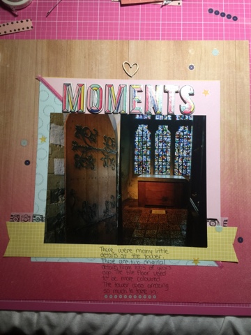
The second layout uses two photos. Now my layout doesn't look anything like the format for Shimelle's. Her two photo layout is the foundation for my third layout which is below.
So this layout has very little in common with Shimelle's. I doesn't even really look like the third layout she made in the video. Which was what I was going to do, since I didn't go with the original two photo layout. This layout isn't on kraft, but I figured I could get away with it for the paper since it was a woodgrain and close to a kraft colour.
There really isn't a whole lot to talk about for this layout. I just made sure to ground the photos with something so they weren't floating in mid "air". The letters are from the Shine chipboard sheet as is the background paper (so gorgeous!!!).
This is the layout that inspired my one picture layout. This layout was actually inspired by the two photo layout. I started making it to use with two photos, but it just wasn't working for me. So I decided that I wanted it to be a one photo layout. Everything on here is from a Hip Kit Club kit, mostly the December one.

The journaling blocks are cut out from the frame paper. I was really unsure of how to use that paper, other than using it for the back side, but I really like how the journaling looks in the frames. I did cut the busy white space out of the photo to make it smaller, I'm really not sure what size that photo turned out to be.
I wanted to keep a lot of white space in this layout to draw attention to the photo. If I did this layout again, I think I would use a light colour paper instead of the blue right beside the photo. I find it distracting. However, I am done scrapping this photo and the story is down! Just something to think about for next time, because there will be a next time!
Thanks for reading this! As a side note, this blog post has taken me a week to write! I have been writing it in bits while at work when I get a free minute to get some sentences down! I'm so glad that I was able to finish this and get it up.


